Landing page
Show the platform first
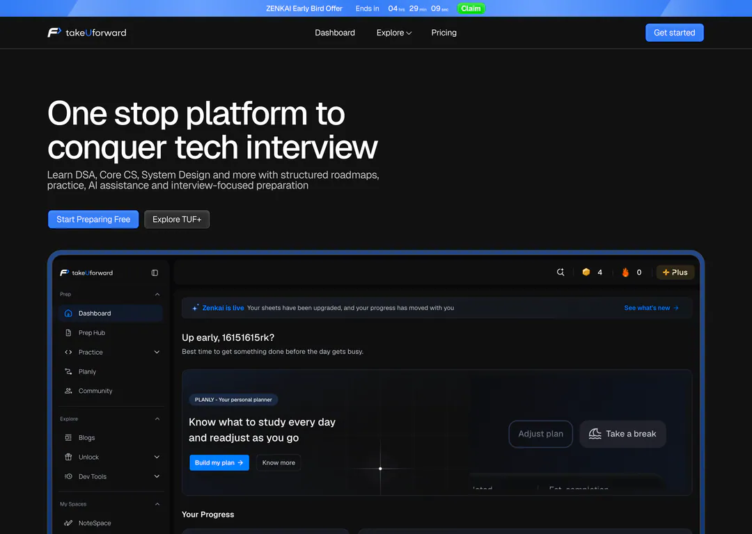
takeUforward helps engineers prepare for tech interviews with DSA, core CS and system design. I redesigned its landing page to lead with the real product and a clear path.
RedesignOverview
- What it is
- An interview-prep platform: structured roadmaps, practice problems, a daily planner and AI help, built around a large YouTube community.
- What I did
- Redesigned the landing page from top to bottom: a product-first hero, a problem section, colour-coded subjects, a testimonial wall, the founder’s story and a simpler ending.
What wasn’t working
- 01
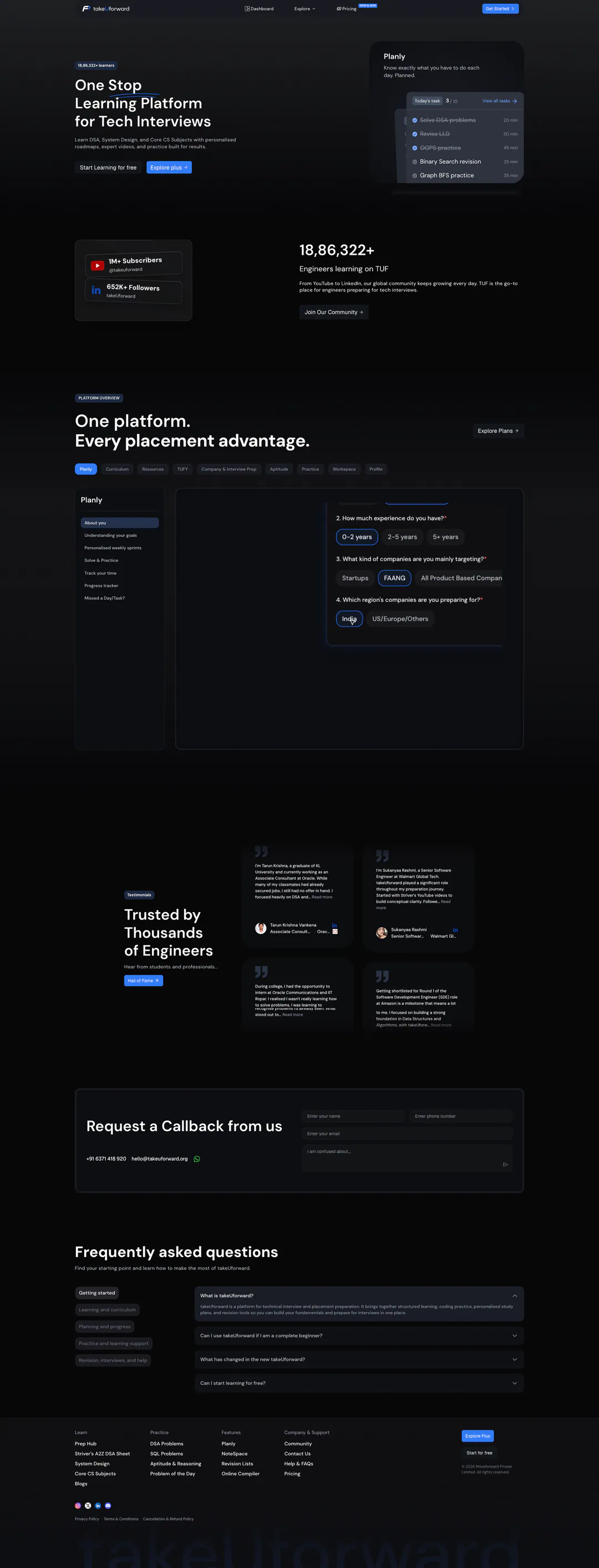
The hero shows one widget, not the platform
A small planner card stands in for the whole product, so visitors meet a single feature before they know what takeUforward is.
- 02
Proof floats in empty space
The learner count and the YouTube and LinkedIn numbers sit in a block of their own with a lot of dead space around them.
- 03
The overview hides behind tabs
Nine pill tabs sit above a mostly empty panel, so you have to click before you learn anything.
- 04
A heavy ending
A callback form, the FAQ and a footer with a giant faded wordmark all compete with the final call to action.

Key decisions
01/06Lead with the whole product
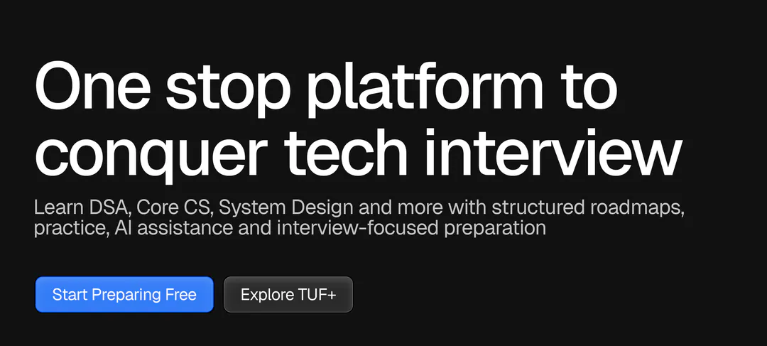
Headline, one subline and two buttons, then the real dashboard right underneath: sidebar, daily plan and progress. Visitors see the platform before they read about it.
02/06Name the problem first
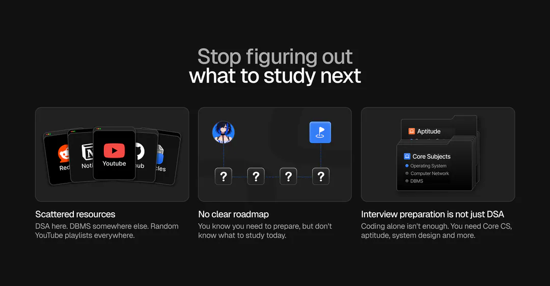
Three illustrated pains describe the reader’s situation (scattered resources, no roadmap, more than DSA) before the page pitches the fix. People keep reading when they recognise themselves.
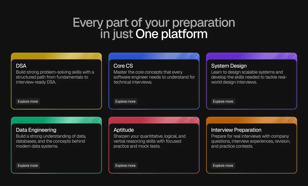
03/06One colour per track
Six subjects get six colours on each card’s edge, so every track is recognisable before you read its title, and the grid reads as six choices rather than one wall of text.
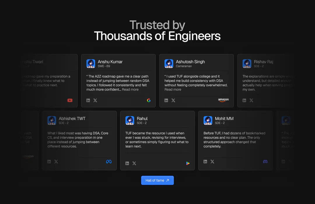
04/06A wall, not a carousel
Two offset rows that fade at the edges show the volume of reviews at a glance. Each card carries a name, role and company logo, so the quote is attributable.
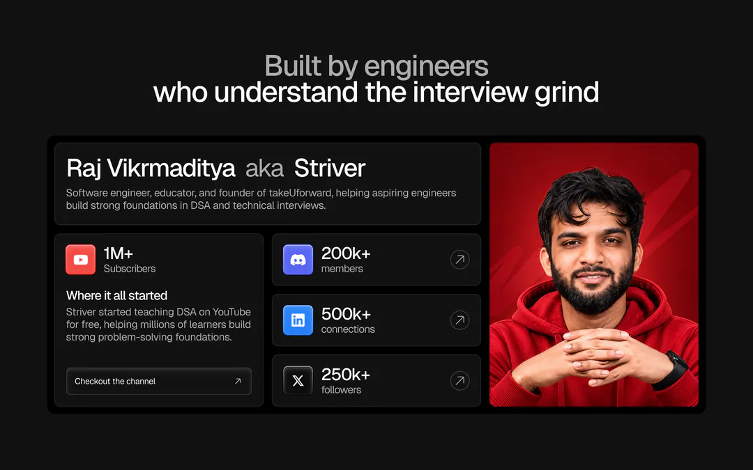
05/06Put a face on it
The founder’s story and his community numbers sit together in one bento, replacing the scattered stats block. The proof now has a person behind it.
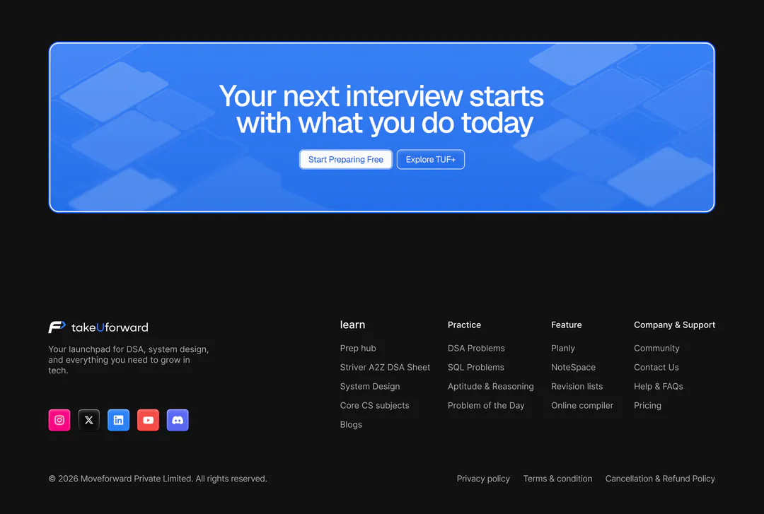
06/06One ask to finish
The callback form is gone and the ending is one blue card with the same two buttons as the hero. The footer is regrouped into four clear columns.
What I’d test next
- 01Hero: a static dashboard screenshot against a short product video.
- 02Whether the colour-coded subject cards help people reach their track faster.
- 03Lead volume after removing the callback form: watch Contact Us clicks.